Villa Project: Kitchen
Bright, open and well-designed, I love the end results of this transformed kitchen.
There are so many things I am excited to share with you about our latest rehab project! This little beauty is on a wonderful street in a stunning Seattle neighborhood and it is loaded with charm. It has some great spaces and I am thrilled to be taking you through the home, one post at a time. Let’s start with the kitchen!
Every centimeter counts!
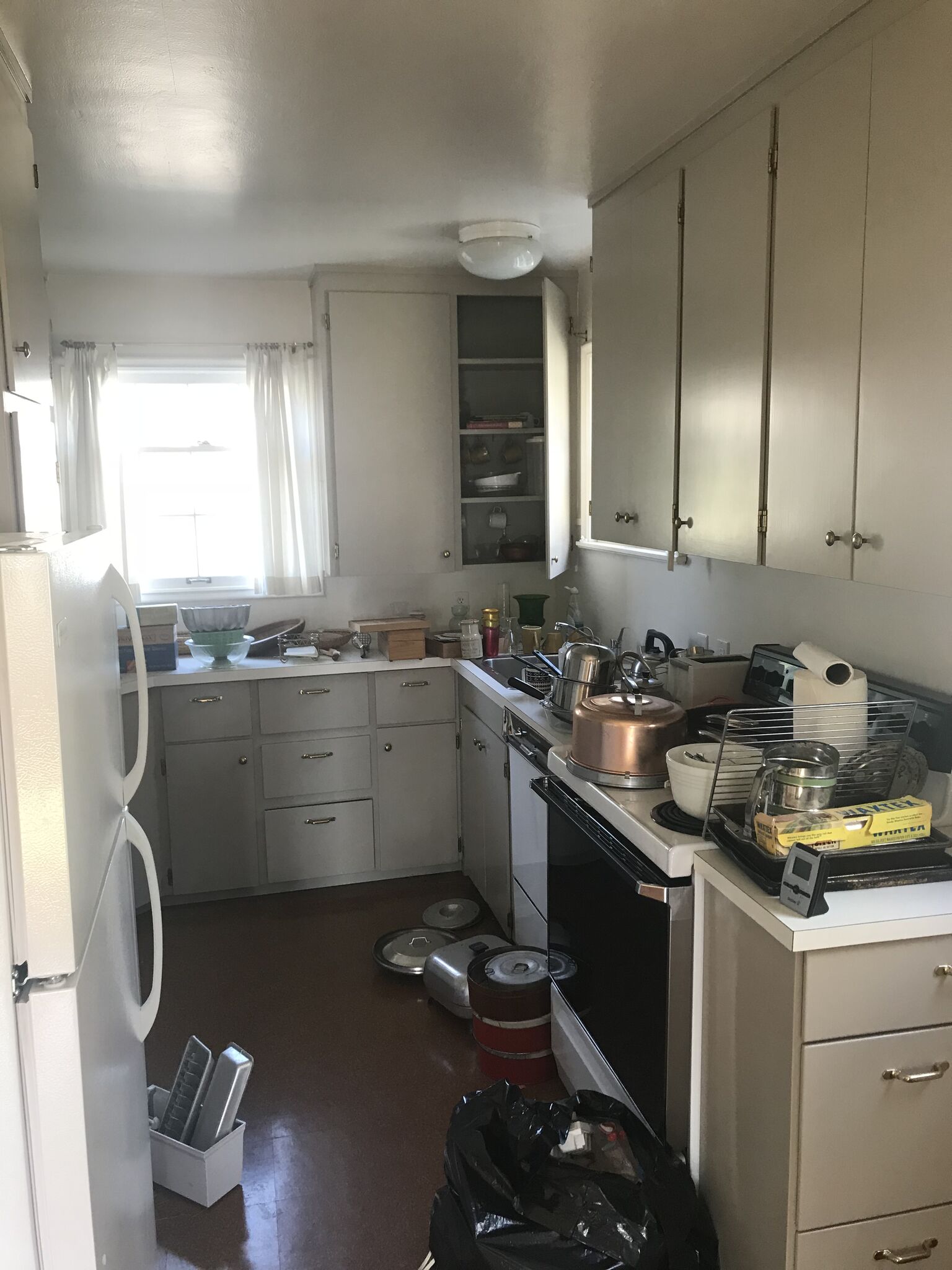
This old space lacked function, light and style.
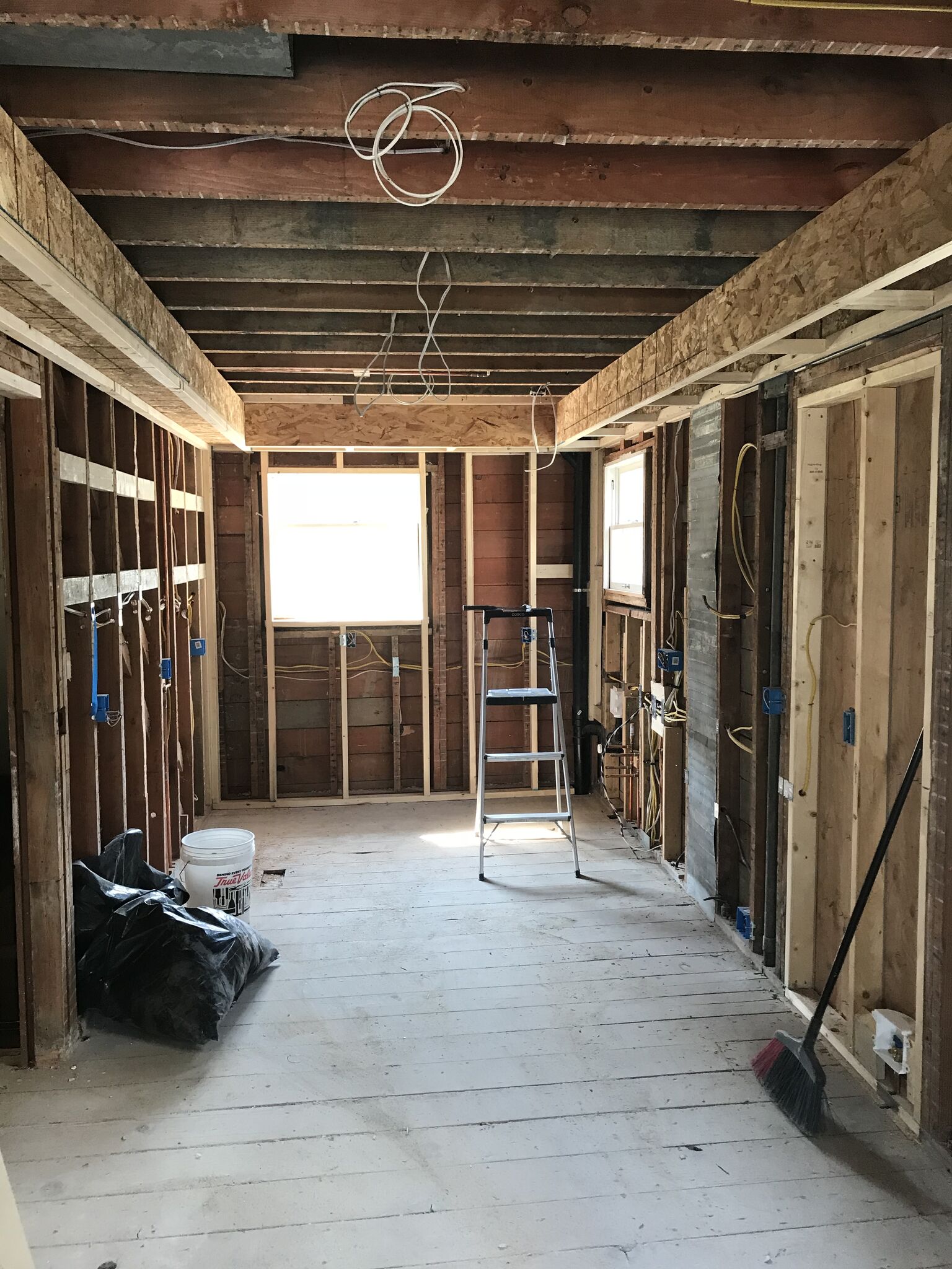
A blank slate is a good place to start.
While I always like to create an open concept when rehabbing, this little jewel did not offer me that option. So, instead we opened it up a bit more by including the dining room with it’s french doors overlooking the outdoor space. On a warm Seattle day, all 3 spaces merge into a light-filled dining/kitchen space.
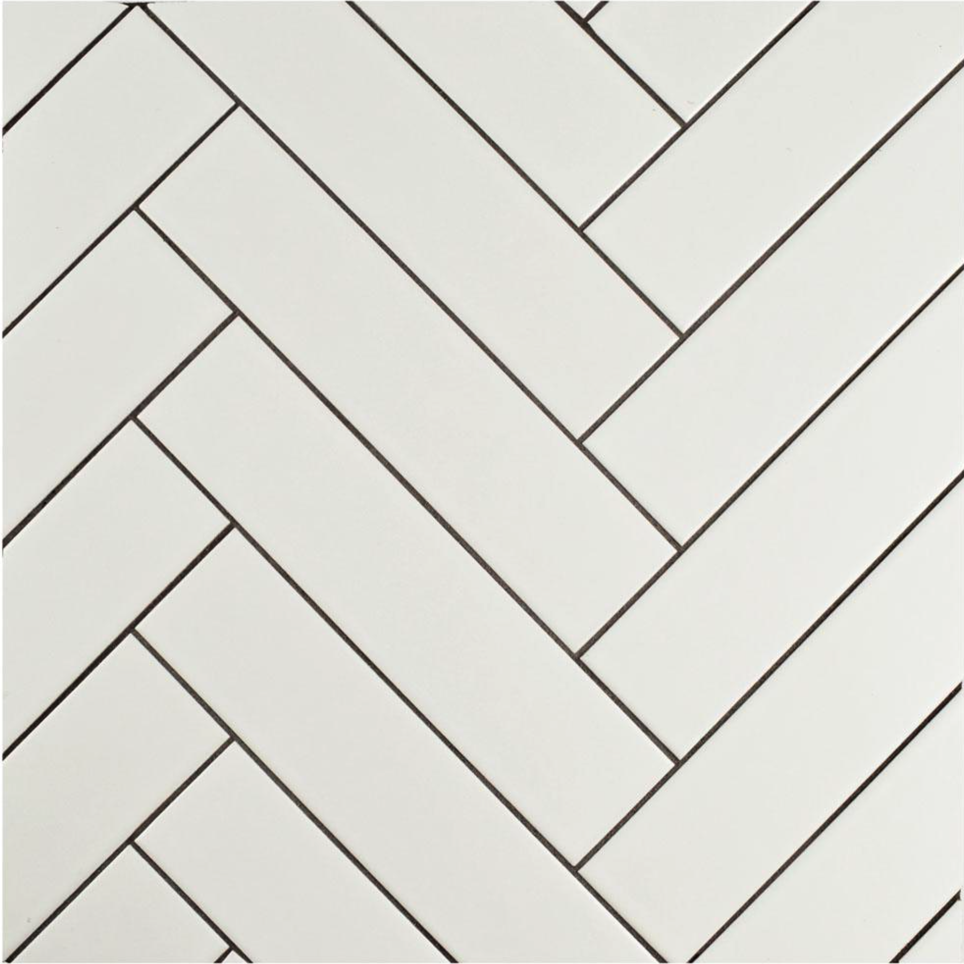
White on white: subway tiles - herringbone style, adjusted counter tops, and open shelving
White Cabinets and Walls: That is our typical go-to “color” because it never seems to go out of style. And for this space it was also perfect. I love the bright cabinets, herringbone backsplash, open shelving, quartz countertops, white walls & trim. These clean choices make the space flow more cohesively, making it feel much bigger and brighter. It will also allow the new homeowners to add design accents that make this kitchen – their kitchen.
Open Shelving: Although many homeowners are adding open shelving to their kitchens no matter the kitchen size, it is especially valuable in a smaller kitchen. It adds that light and open feeling as well as keeping decorative items off countertops.
Cabinet Depth: Typically, cabinets are 24” deep and therefore your countertops are just a bit over that. In this case, we have one wall at 24” counter depth and one wall at 18” deep counter space. Even though one counter may be deeper, this provides an illusion of an equal and larger u-shaped kitchen.
These beautiful floors run throughout the first floor providing necessary unity.
Flooring: Hardwood flooring is always a good idea in kitchens. It was especially important here as we kept the first floor entirely hardwood to marry all the spaces together. Another great “open floor plan” trick.
Still in love with stainless; Not changing that plan yet.
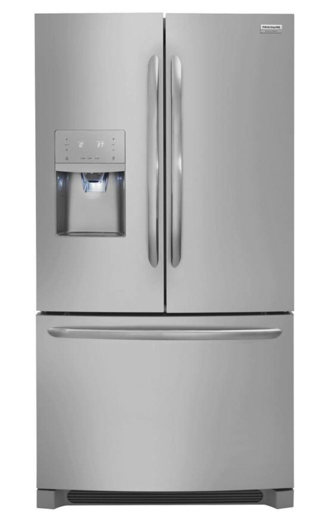
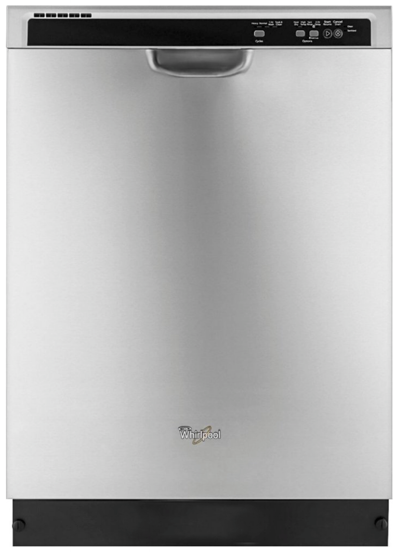
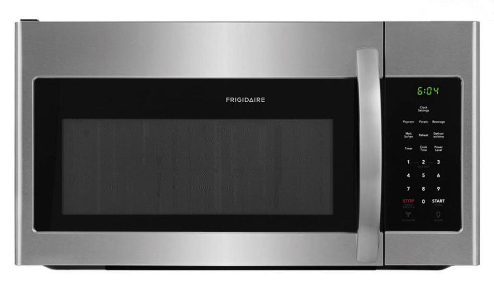
Appliances: We chose stainless for appliances. It’s so clean and blends beautifully with the minimal hardware. It’s also a great option because there’s so many brands to choose from!
I love how this kitchen feels. It is laid out perfectly and offers a lot of storage, workspace, and style!
Here are the details that make up this beautiful kitchen remodel!
1. Fridge
2. Dishwasher
3. Microwave
4. Stove
5. Cabinets
9. Countertops
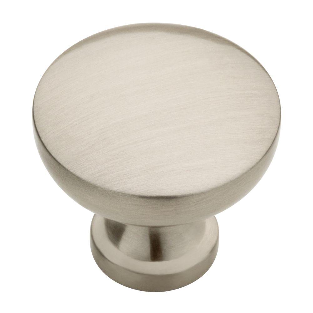
12. Knobs
13. Pulls


